Creating a calm and soothing environment in your home is essential for relaxation and mental well-being. One of the easiest and most effective ways to achieve this is by choosing the right colors for your walls, furniture, and accessories. Calm colors help reduce stress and make spaces feel more comfortable and inviting.
In this post, we’ll explore tips for choosing calm colors that suit your home’s style and needs. Whether you’re repainting a single room or redesigning your entire space, these ideas will help you create a balanced and peaceful atmosphere.
Why Choose Calm Colors?
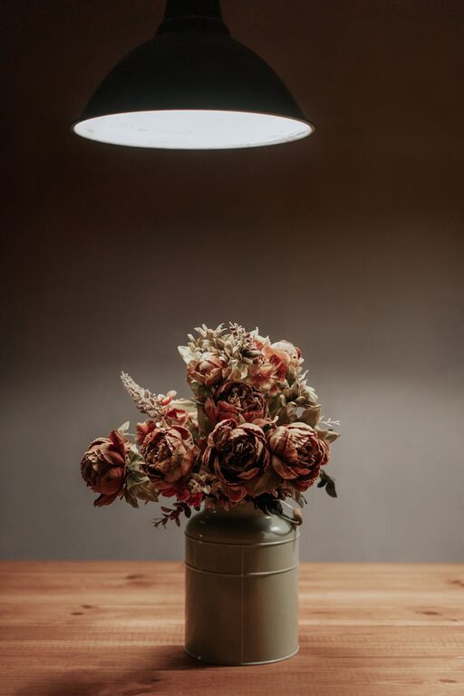
Calm colors typically refer to soft, muted shades that evoke a sense of tranquility. These colors can influence your mood and the overall vibe of a room. Unlike bright or bold colors, calm tones help reduce visual noise, making your space feel more open and restful.
Common calm colors include soft blues, gentle greens, warm grays, and light neutrals like beige or cream. These shades work well in bedrooms, living rooms, or any area where relaxation is a priority.
Tips for Choosing Calm Colors for Your Home
1. Understand the Mood You Want to Set
Before selecting colors, think about how you want to feel in the space. Are you aiming for peacefulness, warmth, or freshness? For example:
– Peacefulness: Soft blues and lavender encourage calm and focus.
– Warmth: Warm neutrals and soft terracotta shades create coziness.
– Freshness: Light greens and mint tones invite nature indoors.
Knowing the mood helps narrow down color choices to those that support your desired atmosphere.
2. Use a Calming Base Color
Start with a base color for your walls or large furniture pieces. It’s best to pick a light tone with low saturation because it reflects more light and keeps the room feeling airy.
Some popular calming base colors include:
– Pale blue
– Warm beige
– Soft gray
– Muted sage green
Once you have the base, you can add layers with accent colors, textures, and patterns.
3. Try Color Samples in Your Space
Colors can look different depending on lighting and surrounding elements. Paint sample patches on your walls or purchase small swatches of fabric or wallpaper to see how they feel throughout the day.
Observe the samples in natural sunlight in the morning and evening, as well as under your indoor lighting. This will help you avoid surprises and ensure the tone remains soothing in all conditions.
4. Stick to a Simple Color Palette
Keeping a simple palette of two or three calm colors can create a cohesive and harmonious space. Too many colors can overwhelm the senses and reduce the calming effect.
For example, pair a soft gray wall with cream furniture and pale blue accents. Or complement a warm beige base with muted green and soft white details.
5. Consider Undertones Carefully
Colors often have undertones that influence their appearance and how they pair with other shades. Blue undertones might feel cool and refreshing, while yellow undertones feel warm and inviting.
When choosing calm colors, pick undertones that align well to avoid clashing or making the space feel unbalanced. Sample paint chips side by side to notice these subtle differences.
6. Use Natural Elements to Complement Colors
Integrating natural materials like wood, stone, or plants can enhance the calming effect of your color choices. For instance, light wood furniture pairs beautifully with soft green or blue walls, adding warmth and texture.
Plants contribute natural greenery that boosts relaxation and air quality, while natural fibers like cotton or linen add softness to the overall look.
7. Balance Color with Lighting
Even calm colors can feel dull or unsettling without proper lighting. Maximize natural light by using sheer curtains and reflective surfaces like mirrors. For artificial lighting, choose warm white bulbs to create a cozy atmosphere.
If your space has limited natural light, opt for lighter calm colors such as pale yellows or creams to brighten the area.
8. Don't Forget the Ceiling and Trim
Often overlooked, the ceiling and trim can influence the room’s feel. Painting the ceiling a soft white or very light tint of your wall color can help make the room feel taller and more open.
Similarly, choose trim colors that complement your walls without creating harsh contrasts. Subtle, matching tones maintain the soothing effect.
Popular Calm Color Choices for Different Rooms
Bedroom
In bedrooms, sleep and relaxation are priorities. Soft blues, muted lavender, and pale greens work well. Avoid overly bright or stimulating colors like red or vibrant orange.
Living Room
The living room often serves multiple functions, so versatile calm colors are best. Warm grays, soft taupes, or gentle greens provide a neutral backdrop that works with a variety of furniture styles and accent colors.
Bathroom
Bathrooms benefit from fresh, clean colors. Pale aqua, seafoam green, or light gray evoke a spa-like feeling, promoting calm and cleanliness.
Kitchen
Soft yellows, sage green, or creamy whites can brighten kitchens while keeping the environment relaxed and inviting.
Final Thoughts
Choosing calm colors for your home is a rewarding way to create peaceful spaces where you can unwind and recharge. Focus on your mood goals, test samples in your environment, and stick with simple, harmonious palettes to make the process easier.
Remember that color preferences are personal, so trust your instincts and enjoy experimenting until you find the perfect calm colors that feel like home to you.
Happy decorating!